As a designer at various stages in their career, there are design samples or simple flyers that you have seen or perhaps designed yourself that you absolutely loved. Today, we decided to ask some designers what their favorite designs are and why they love them.
The Mastercard Flyer from their 2019 Campaign.
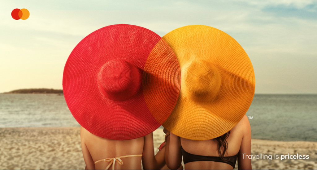
“What’s fascinating is how the compositions from each of the designs still show the Mastercard Logo composition. It just goes to show how our mind has been trained to recognize big brands’ logos even in the most abstract way.” – Joshua Oladiti
Afropunk 2018 Flyer
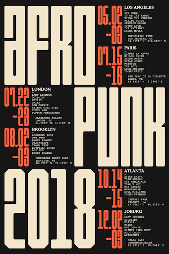
“The major thing I love about this flyer is the fact that there were no images used. It’s just mid-bold texts and the use of colors that just work well together. It just makes it stand out. It looks like something made in the 90s but also has a modern look to it.”
– Idowu Samuel
This Oedemy Digital Flyer
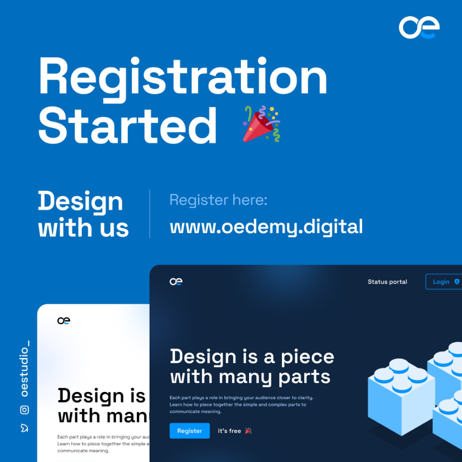
“This is one of my favorite flyers because of the color and the typeface used. I like the fact that it contains a single typeface throughout. The alignment was also great. It’s a top-notch design hierarchy to me.” – Boluwatife Babatunde




Our Designers Pick Out Simple Flyers They Love and They Tell Us Why